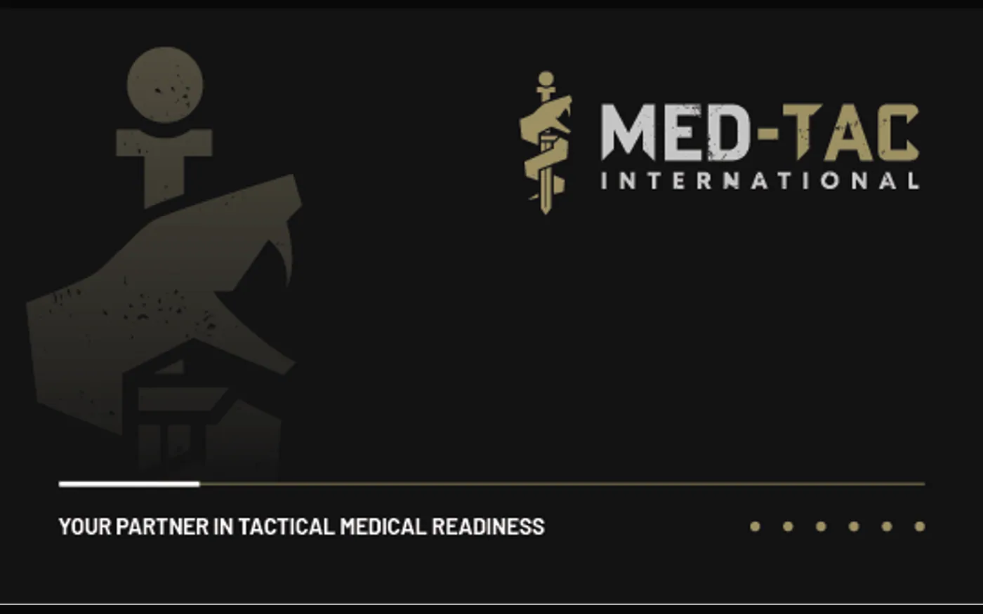
MED-TAC International — brand foundation for a tactical medical supplier
MED-TAC International needed a brand system that could match the seriousness of the tactical medical market: credible with military, EMS, and prepared civilian audiences, consistent across every touchpoint, and ready for the next phase of product education, web, and marketing growth.
- Complete Brand audit
- Modernized Logo system
- Extended Collateral
- Documented Guidelines
- Wk 01 Brand audit, SWOT review, and competitive research
- Wk 02 Positioning, values, purpose, and audience messaging
- Wk 03 Logo direction, visual identity, and brand applications
- Wk 04 Brand guidelines, collateral examples, and tactical messaging framework
The problem
MED-TAC International Corp. had built trust around tactical medical products and training, but the brand system needed more consistency, clarity, and market presence. The existing identity did not fully reflect the company’s reliability, veteran-led expertise, and life-saving mission.
The goal was not simply to make the brand look cleaner. It needed to feel credible to military personnel, first responders, and prepared civilians while giving the business a stronger foundation for future website, campaign, and sales materials.
What we built
We started with strategic reconnaissance: brand audit, SWOT review, competitive research, audience context, and positioning. From there, we clarified the brand core: values, purpose, audience promise, and the practical market position behind the offer.
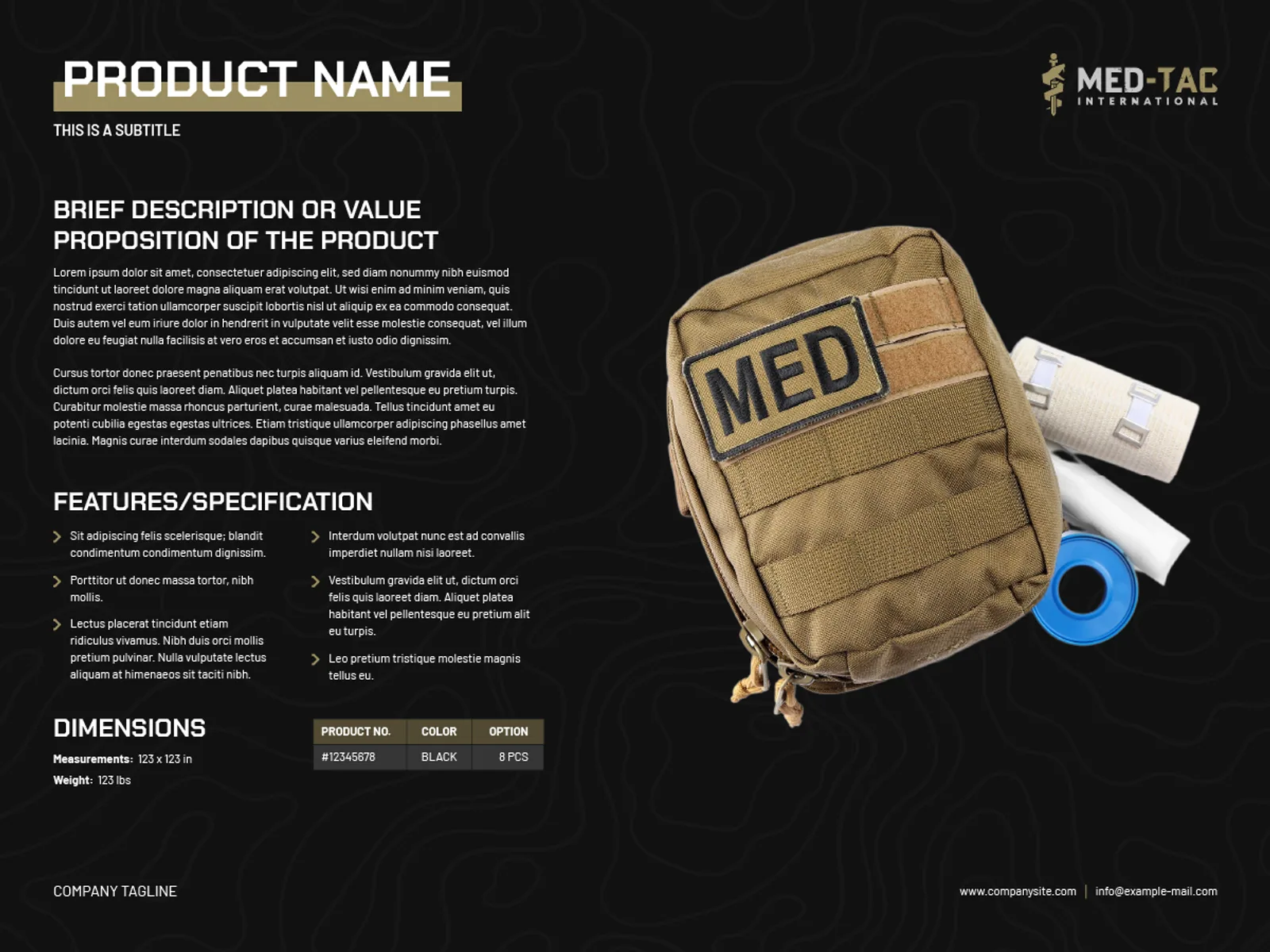
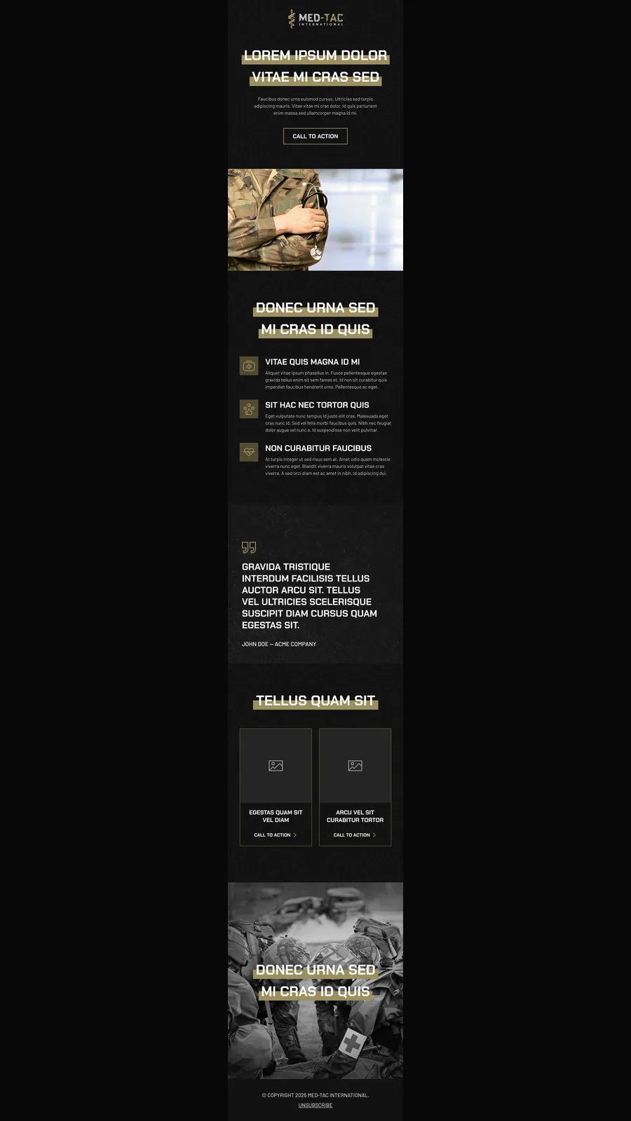
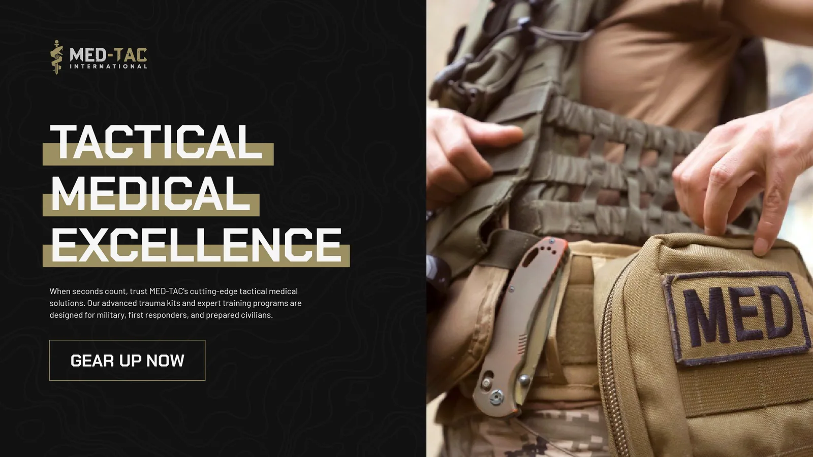
Then we built the tactical foundation: a modern logo system, visual direction, typography and color standards, brand applications, and a guideline book the team could use across future touchpoints. The system also extended into practical launch collateral so the brand could show up consistently in product education, email campaigns, social posts, business cards, stationery, and sales documents.
What shipped
- Strategic branding roadmap
- Brand audit, SWOT review, and competitive research
- Positioning and foundational messaging framework
- Modern logo direction and visual identity system
- Brand guideline book covering logo usage, typography, color, imagery, and application standards
- Elevator pitch, tagline direction, and CTA language for MED-TAC’s core audiences
- Product information sheet direction for tactical medical kits and specifications
- Email newsletter layout for education and campaign activation
- Social post templates across widescreen, square, portrait, and story formats
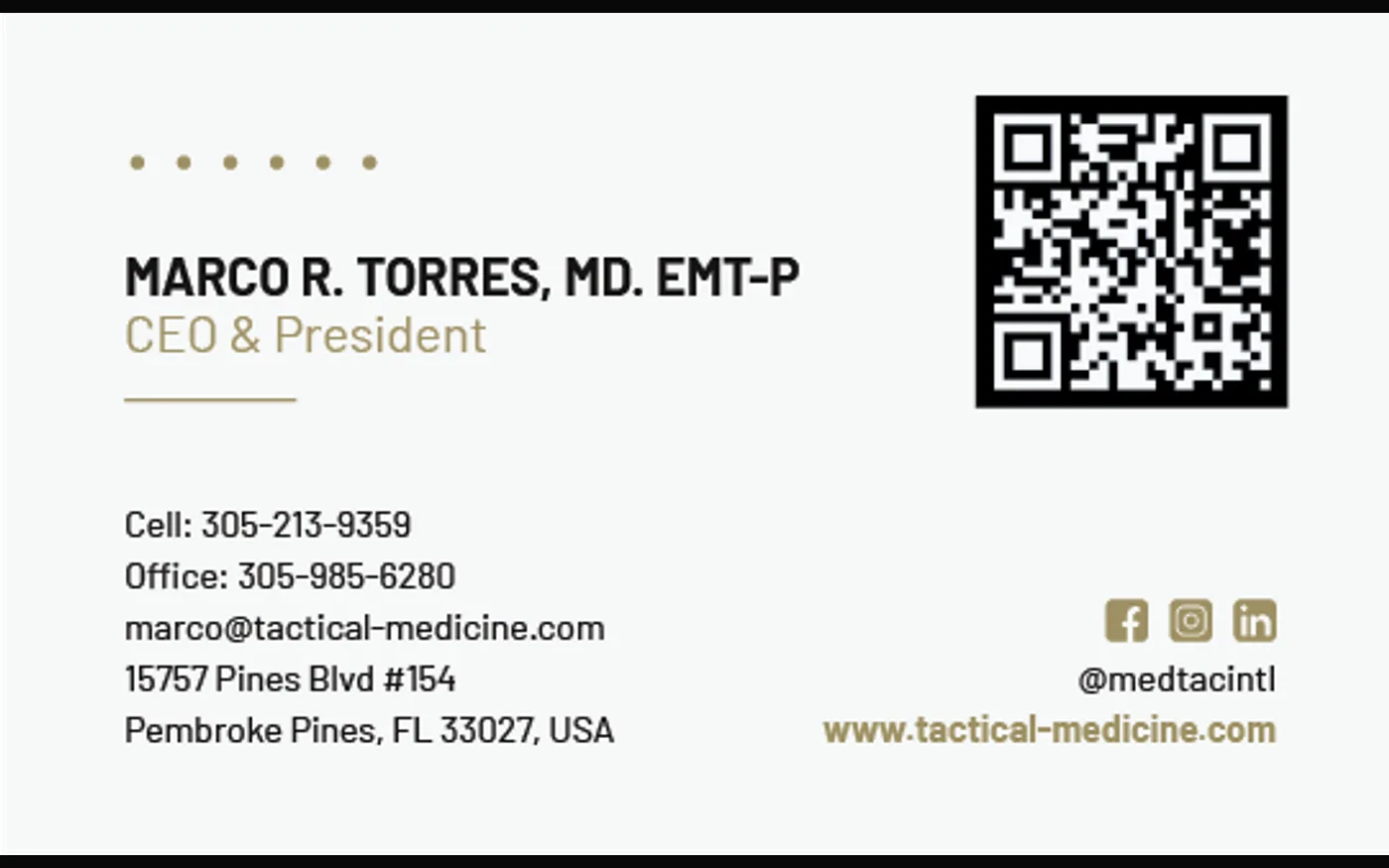
- Stationery and business card applications for formal sales and partner touchpoints
- Badge and seal assets for trust-building brand applications
Why it matters
Tactical medical buyers need trust before they need polish. The brand has to communicate seriousness, readiness, and reliability quickly. MED-TAC’s new foundation gave the company a cleaner market presence and a scalable system for the website redesign, product documentation, email campaigns, social content, and future marketing pushes.
Public source
This engagement was originally published in Wolftac’s Webflow project archive: Tactical Foundation Rebranding.
A tactical medical identity system built to ship across every touchpoint.
The MED-TAC foundation moved beyond a logo refresh. We built a field-ready visual system for product education, launch content, email campaigns, business cards, stationery, and future web growth.
View the informational document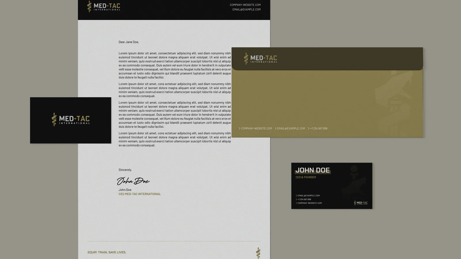
A version of this for your operation.
Every engagement starts with a scoped briefing — the operating constraint, the simplest system that removes it, and whether we’re the right team to build it.